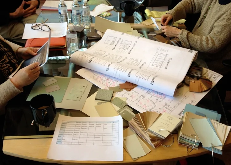
Color names are intriguing and sometimes rather amusing. Imagine having the job to name colors! The paint color we chose to unify the office space walls was Mindful Grey. We liked the color before we knew the name but when we saw the name , we knew this was the one.
“Grey has no agenda. . . . Grey has the ability, that no other color has, to make the invisible visible.” ―author Roma Tearne
The mindful grey color was used in the hallways and in all the rooms. Each room then has an accent wall in a distinctcolor. To select those colors we looked to nature. A peaceful lake green in one treatment room and a soft early dawn blue in another. The conference makes the boldest color statement of all with a teal green reminiscent of Traverse Bayon a bright summer day. David’s office and the reception area are painted in a vibrant copper rust.
We all perceive the world in our own unique way. I am quite sure that we all see color in unique and specific ways too. Have you noticed when trying to describe a color to another person we make up and use adjective likeblue-ish green or peachy-pink. The diversity of our perceptions about color and all things really, is what makes living together in this world both fascinating and frustrating, limited and limitless.
Like our walls, our own mindfulness (grey or whatever color it is) can lead us all to create unity. Unityis something we all crave. When we are being mindful we are connecting to the source that really does indeed unify us all.
